Design systems are operating systems for taste
Tokens don’t make a brand consistent. Decisions do. What our own Gate process taught us about codifying judgement.
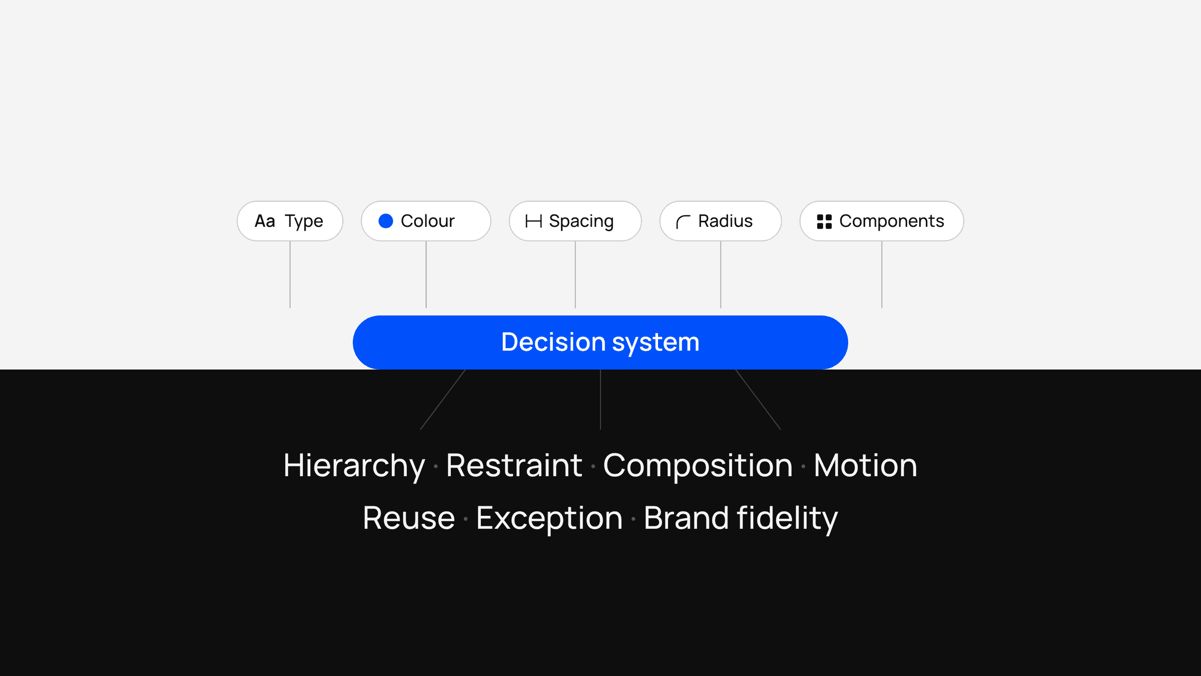
Contents7 sections
Most design systems are good at describing what already exists.
They define colours, type scales, spacing, components, states and rules. They reduce inconsistency and make implementation faster.
But the hardest part of design is rarely remembering the border radius.
It is deciding what belongs.
That is where many systems stop too early.
A mature design system should not only preserve visual consistency. It should preserve judgement.
Tokens are not taste
Tokens are useful because they constrain choice.
A designer does not need to decide between 17 shades of grey if the system already contains the four that matter. An engineer does not need to guess the spacing between components if the scale is defined.
But tokens cannot explain why one composition feels right and another does not.
They cannot tell you:
- when a section should be dense or quiet;
- when an image deserves full bleed;
- when a card is unnecessary;
- when motion is clarifying and when it becomes decorative;
- when a page has enough hierarchy;
- when a component should be reused and when the content deserves a new pattern.
Those decisions are where taste lives.
A system that codifies only tokens still depends on individual judgement for everything important.
The real system is a set of decisions
In practice, the most useful design rules are often written in ordinary language.
- “Do not put everything in cards.”
- “Project work should keep the client’s visual identity rather than being recoloured into ours.”
- “Motion should explain hierarchy, orientation or feedback—otherwise remove it.”
- “Do not add a third item just to make a three-column grid look complete.”
These rules are not style tokens. They are decision constraints.
They tell the team how to behave when the exact screen has never been designed before.
That makes them more valuable than a component library alone.
A component library tells you what you can use. A judgement system tells you what you should use.
- Judgement gatesQuestions every new section, interaction or component must pass
- RulesDecision constraints, written in ordinary language
- ComponentsWhat you can use
- TokensColour, type and spacing: constrained choice
Why this matters more with AI
AI-assisted design and development makes this problem much more obvious.
A coding agent can reproduce a component quickly. It can infer layout patterns, generate variations and fill in missing implementation details.
What it cannot reliably infer is the invisible standard behind the work.
If the only instruction is “match the design system,” an agent will often produce something technically consistent but visually generic.
The spacing is correct. The colours are correct. The components are correct.
The result still feels wrong.
Why?
Because the agent followed the visible rules and missed the judgement behind them.
The solution is not more detailed screenshots. It is better codification of taste.
A gate is more useful than a template
One way to think about this is as a series of gates.
Before a new section, interaction or component is accepted, it passes a small set of questions.
Gate
- Does this create a new visual idea, or repeat one that already exists?
- Is the hierarchy obvious without decoration?
- Is the interaction necessary?
- Is this component being used because it is appropriate, or because it already exists?
- Does the client work remain authentic to its own identity?
- Does the mobile version preserve the same idea, or merely stack the desktop version?
These questions function like an operating system for design decisions.
They do not prescribe the final answer. They constrain the space of acceptable answers.
That is important because strong design systems need both consistency and variation.
Codifying motion is part of taste
Motion is a good example.
A typical system might define durations and easing curves. That is useful, but incomplete.
The more important rules are conceptual:
- nothing moves without a reason;
- navigation should respond immediately;
- hover should not reflow layout;
- reduced-motion users should not lose information;
- one or two signature moments are more valuable than animation everywhere.
These rules stop a team from using technically valid motion badly.
The same is true of typography, imagery and layout.
A system should encode not only values, but restraint.
The system should be legible to machines
For a long time, design systems were primarily built for designers and engineers.
That is changing.
If AI agents are going to participate in implementation, then the system needs to be readable by machines too.
That means the important judgement cannot live only in someone’s head or inside a Figma file.
It needs to exist in structured, explicit language:
- source-of-truth hierarchy;
- component rules;
- motion rules;
- content rules;
- accessibility constraints;
- responsive behaviour;
- prohibited patterns;
- criteria for when to create something new.
This is less glamorous than a component showcase.
But it is what allows an AI coding agent to produce work that feels like it belongs to the same product.
Consistency is the output, not the goal
A good design system produces consistency, but consistency is not the highest-order goal.
The goal is coherence.
Coherence allows different pages to have different rhythms. Different projects to carry different colours. Different interactions to feel distinct.
They still belong together because the same judgement is operating underneath them.
That is why the best design systems eventually stop feeling like libraries.
They become operating systems for taste.
The components matter.
The tokens matter.
But the real leverage comes from capturing the decisions that made them worth building in the first place.