Interfaces for reasoning: showing the work without the noise
A visual essay on how products should expose what their intelligence is doing, and when they shouldn’t.
Contents7 sections
Intelligent products create a new interface problem.
Users want to know what the system is doing.
They do not want to watch everything it is doing.
Those are very different requirements.
As software begins to interpret, decide, plan and act, product teams need to decide which parts of that process should become visible.
Show too little and the product feels opaque.
Show too much and the interface turns into a transcript of machine activity.
The goal is not to expose reasoning. The goal is to expose enough evidence for the user to understand and control the outcome.
Show state, not internal monologue
A system can be working without narrating itself.
The user usually does not need a stream of thoughts. They need to know:
- what is happening;
- what information is being used;
- what step the system is on;
- whether something is blocked;
- what decision has been made;
- what requires their attention.
This is a state-design problem.
A useful interface might show:
- Reviewing documents3 of 5 received
- Checking eligibilityOne requirement needs confirmation
- Preparing responseWaiting for approval before sending
These states communicate progress without pretending that raw model reasoning is useful product content.
The user learns what matters operationally.
1StateWhat is happening
2EvidenceWhat supports it
3ActionWhat can happen next
4ExceptionWhat needs attention
Confidence should appear as behaviour
Teams often reach for confidence scores.
“87% confident.”
Sometimes that is useful. Often it is not.
A number without context creates false precision.
A better interface may express uncertainty through behaviour.
The system asks a clarifying question.
It presents two interpretations.
It marks a field as unresolved.
It recommends a next step but does not execute it.
It escalates the case.
These are interface decisions, but they are also trust decisions.
Users do not need to know the exact internal probability distribution. They need to see that the system recognises when certainty is insufficient.
Evidence matters more than explanation
When an intelligent system makes a recommendation, the strongest form of transparency is often evidence.
- Where did this value come from?
- Which document supports this statement?
- What customer message triggered this action?
- Which policy or rule is being applied?
A short evidence trail is usually more useful than a long explanation of how the model reached a conclusion.
This is especially true in high-consequence workflows.
A decision that can be traced is easier to review, challenge and correct.
A decision that is merely explained can still be impossible to verify.
Separate activity from outcome
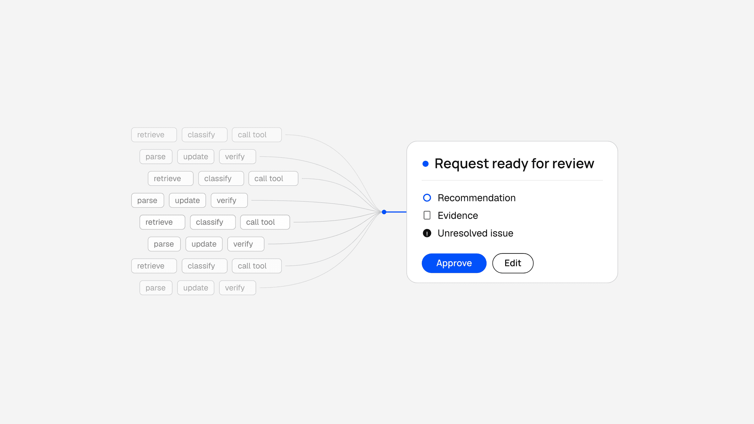
One reason agent interfaces become noisy is that activity and outcome are mixed together.
The product shows every intermediate event:
- searched database
- called tool
- retrieved record
- parsed response
- updated state
- generated draft
Most of that is useful for debugging. Very little of it is useful to the end user.
The interface should compress machine activity into meaningful product states.
Instead of:
- Called CRM API
- fetched 12 fields
- detected missing phone number
- searched previous conversation
- found phone number
- updated record.
Show:
- Lead record updatedPhone number recovered from the previous conversation.
Same underlying work.
Very different interface quality.
Escalation deserves its own interface
Human handoff is often treated as a message in a chat history.
It should be designed more deliberately.
A good escalation state should answer:
- Why did the system stop?
- What has already been completed?
- What decision is needed?
- What happens after approval?
- Can the user change the proposed action?
The ideal handoff makes the human feel like they are entering at the point of judgement, not restarting the workflow.
This is one of the most important interaction patterns in agentic software.
Progressive disclosure is the right default
Most users want outcomes first and detail second.
That suggests a layered model.
OutcomeAt the top level
- Request ready for review
SummaryOpen it
- Summary
- Recommendation
- Evidence
- Unresolved issues
DetailOpen further
- Detailed activity
- Source records
- System logs where appropriate
The interface should let the user move from confidence to inspection without forcing everyone through the same depth.
This is particularly important when one product serves both operators and managers.
The operator may need the detail.
The manager may only need the exception.
Good intelligent interfaces feel quieter
There is a temptation to make AI visible because AI is part of the product story.
Glowing borders. Thinking indicators. Animated gradients. Streaming text. Constant signs that “intelligence” is happening.
Most of these become tiring quickly.
The more capable the system becomes, the less it should need to perform intelligence theatrically.
Good agent interfaces should feel calm.
They should foreground:
- status;
- evidence;
- action;
- exception.
The intelligence can remain mostly invisible until the user needs to inspect it.
That is not hiding the system.
It is designing for relevance.
The best interfaces for reasoning do not show the machine thinking.
They show the user exactly what they need in order to trust, understand and control what happens next.